A candlestick chart shows you what price did. It doesn't show you why.
Behind every candle is a collision between passive orders sitting in the book and aggressive orders coming in to fill against them. The candle records the result. The heatmap shows you the collision itself — in real time, as it happens, price level by price level.
This is the core of what QuantFlows visualizes. Before you trade with it, you need to understand what you're actually looking at.
What the Heatmap Is Showing You
The heatmap is a time-based visualization of the limit order book. Every resting limit order — every bid sitting below price waiting to buy, every ask sitting above price waiting to sell — gets plotted as a colored cell on the grid.
The horizontal axis is time moving left to right. The vertical axis is price. Color intensity tells you how much size is sitting at each level.
This is fundamentally different from a price chart. A candle tells you: "price was here, moved there, closed here." The heatmap tells you: "at this price level, at this moment, there was $14.3M in resting bids." One is a record of outcomes. The other is a map of the forces that produce them.
In QuantFlows, the heatmap runs across Binance, Bybit, OKX, and Hyperliquid simultaneously — giving you aggregated order book depth across the four largest crypto futures venues in a single view.
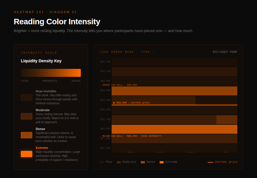
Reading Color Intensity
The color scale in QuantFlows runs from low opacity (thin liquidity) to high opacity (dense liquidity). A bright orange band at a price level means a significant concentration of resting orders at that level. A nearly invisible cell means almost nothing is sitting there.
This matters for two reasons.
First, price moves faster through thin areas. When there's no resting liquidity to absorb incoming aggressive orders, market orders eat through levels quickly. You'll see this on the heatmap as price slicing through faint zones with no resistance. Second, price slows or reverses at dense areas — but only if that liquidity holds.
The practical read: when price approaches a bright horizontal band, pay attention. Something is about to happen. Either that wall absorbs the pressure and price reverses, or the wall gets pulled before price gets there, or aggressive orders eat through it entirely and the level fails. Which behavior you observe tells you a great deal about the strength of that level.
The Three Liquidity Behaviors That Matter
Once you can read density, the next layer is behavior. Resting liquidity does one of three things as price approaches it, and each tells a different story.
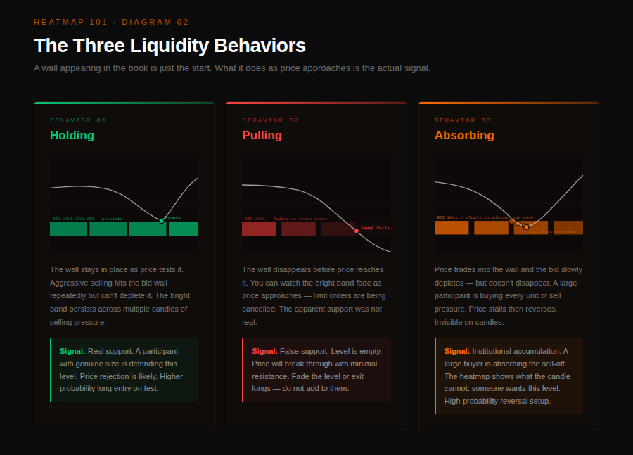
- Holding. The wall stays in place as price tests it. Aggressive orders hit it repeatedly and it absorbs them without giving way. In QuantFlows you'll see the bright band persist through multiple candles of selling pressure.
This is genuine support or resistance — a participant with real size defending a level. It doesn't mean price can never break it, but it means something meaningful is on the other side. - Pulling. The wall disappears before price reaches it. You can watch the bright band fade as price approaches — limit orders are being cancelled. This is a critical signal. What looked like support is being withdrawn. Price is about to move through a level that appeared defended, with no actual buyers there to catch it. Pulled liquidity is one of the most reliable short-term directional signals the heatmap produces.
- Absorbing. Price moves through a level aggressively, but a large bid wall behind it keeps eating the flow without being depleted. The wall shrinks slowly as market orders hit it, but doesn't disappear. This is absorption — a large participant accumulating into selling pressure. Often precedes a reversal. Often missed entirely on a candlestick chart because the candle just shows price moving sideways.
Spoofing: The Wall That Disappears
A specific version of the pulling behavior deserves its own explanation because it's common in crypto futures and dangerous if misread.
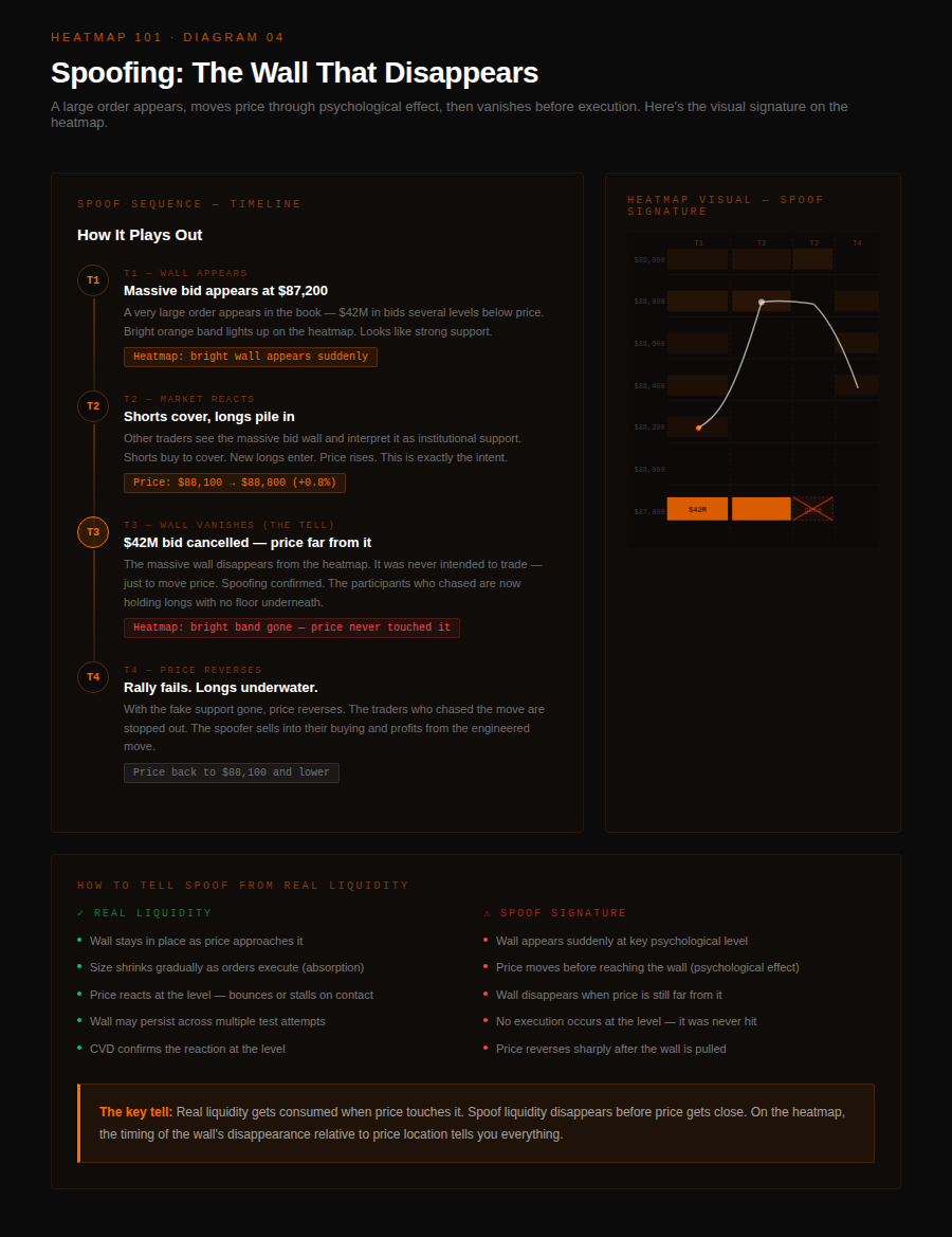
Spoofing happens when a large limit order appears in the book — creating the appearance of a strong support or resistance wall — but is pulled before price reaches it.
The intent is to influence other participants: a large bid wall at $85,000 signals to others that there's strong buying interest, which may cause shorts to cover and buyers to step in. Once the desired price movement has occurred, the spoof order is cancelled.
In QuantFlows, spoofing has a visual signature: a bright band appears suddenly at a key level, influences price movement, then disappears well before price gets close enough to trade against it. The tell is the timing — real liquidity stays in place as price approaches. Spoof orders evaporate the moment they've done their psychological work.
Combining Heatmap With CVD
The heatmap shows you where resting liquidity is. CVD (Cumulative Volume Delta) shows you the directional pressure of aggressive orders — how much buying versus selling force is hitting the book. Together they produce the clearest picture of what's actually happening at any level.
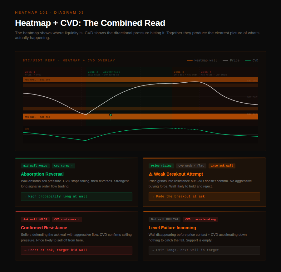
The combination that matters most: price approaches a large bid wall while CVD is trending downward. Aggressive selling is hitting the book. If the wall holds through that pressure, it's real.
If CVD starts flattening and reversing while the wall remains intact, absorption is happening. The combination of a persistent bid wall on the heatmap with CVD bottoming is one of the higher-probability reversal signals in order flow trading.
The opposite scenario is equally useful. Price is grinding higher. A large ask wall sits above. CVD is weak — not trending strongly upward. That means there isn't enough aggressive buying pressure to break through serious resistance. The bid side needs to build more conviction before this level breaks. Enter cautiously; don't assume breakout.
Reading the Book in Practice: What to Look For
When you open QuantFlows and look at the heatmap for the first time, the volume of information can be overwhelming. Start with these specific observations:
- Find the nearest significant wall. Where is the brightest band relative to current price? How far is it? Is it on the bid side (support candidate) or ask side (resistance candidate)? That wall is the first thing price will interact with — it should inform your bias.
- Watch how the wall behaves as price approaches. Is it staying? Is it shrinking gradually (absorption) or disappearing suddenly (pulling/spoofing)? The behavior in the last few minutes before contact is more informative than the presence of the wall itself.
- Check CVD direction simultaneously. Is aggressive flow confirming or contradicting the direction price is moving? A price move supported by CVD is more likely to continue. A price move opposed by CVD — price rising while CVD falls — is a divergence worth watching.
- Look for historical holding levels. In QuantFlows, scroll back through the heatmap. Where did bright bands appear repeatedly? Where did price reverse? Levels that held multiple times become structurally significant — they're levels where real participants have demonstrated willingness to defend.
What the Heatmap Doesn't Tell You
No tool eliminates uncertainty. The heatmap shows you where resting liquidity is — it doesn't tell you whether it will hold. Large walls can be hit and broken. Absorption can fail. Spoof orders can move price before you identify them.
What the heatmap does is remove the information disadvantage that candle-chart traders operate under. When a level on your chart looks like support, the heatmap tells you whether real size is actually there — or whether the "support" is an empty level that price will blow through without resistance.
The traders who use this tool well aren't using it to predict the future. They're using it to stop trading against invisible forces and start trading with clear information about what's actually in the book.